
How do you define Buffalo?
Capturing the full essence of the region for Buffalo’s first-ever national destination marketing campaign may seem like a challenging undertaking. But staff and leaders at Visit Buffalo knew the solution: look to Buffalo’s own.
In interviews with two dozen community members, elected officials, business leaders and more, Visit Buffalo and its advertising partner MMGY Global gathered voices from the community to directly inspire its groundbreaking $3 million advertising and rebranding campaign. Across major U.S. cities, you’ll now see ads touting Buffalo’s food, architecture, waterfront, arts, culture and even snow, all in the words of its people.
“Our locals are our best ambassadors. It was important to us for the community to feel like they’re a part of this. We want them to be proud of it, so they can share it,” explained Patrick Kaler, Visit Buffalo president & CEO. “We’ve already received feedback from residents that these ads, down to the colors we chose, are really resonating with people here.”
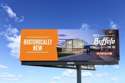
Kaler says Visit Buffalo’s new brand color palette is inspired by the sights, flavors and history of the region, even down to the colors’ names. The bold orange “Wing Sauce,” the cool, deep blue “Harbor” and the fresh, beige “Silo” call to mind the vivid colors of the city itself. The secondary colors are a nod to the art deco of City Hall as well as the Roycroft palette, creating a connection between Buffalo’s urban and rural charms. The fonts selected and lightning-bolt-shaped f’s in “Buffalo” convey the city’s strength, along with its storied history in hydroelectricity.
So, how do you convey the entire story of Buffalo through a single ad? Visit Buffalo’s campaign uses simple, seemingly contradictory two-word combinations like “no-fuss fancy” that came directly from the stakeholders interviewed. The phrases embrace the city’s dimensionality, all brought together by the tagline, “That’s Buffalo for you.”
“It’s a new twist on talking about our history,” Kaler says. “The phrase ’Refreshingly Spicy’ tells the story of our culinary scene. It highlights the wings, of course, but also our many other culinary offerings. ‘Polished Grit’ refers to the stark examples of our industrial past like the grain silos or warehouses that have now been transformed and repurposed in unique ways that speak to the heart of Buffalo.”
The campaign includes several variations of these two-word combinations, which allows Visit Buffalo to customize placements in various publications, locations and digital platforms.
The rebrand also came with a new name. Over time, Visit Buffalo will replace references to the former Visit Buffalo Niagara agency name.
“Our research shows that visitors to the Buffalo area are truly coming for our cultural assets, outdoor recreation, our culinary scene, sports and more. While Niagara Falls will always be part of our story, Buffalo is now strong enough to stand on its own,” explains Kaler.
The new campaign represents the start of a long-term strategy to keep Buffalo in people’s minds as a destination, beyond the drivable markets like Southern Ontario, New York City, Cleveland and Pittsburgh. Visit Buffalo will now steadily broaden its reach and market more aggressively in areas like Chicago, Boston, Philadelphia and Washington, D.C.
“We’re thrilled to be able to take our message nationwide,” says Kaler. “This is the start of a sustained effort to share our story with more potential visitors. We’re looking forward to the long-term results of getting our message out there in new U.S. markets, and ultimately, globally as well.”